FITz
In doing an eCommerce project, there is not a lot of room to be different as the common internet buyer is looking for a familiar experience and most importantly the best deal. This is where the idea for FITz comes in, giving a familiar and seamless experience to the consumer and including bundle prices for the best deals.
My Role: Product Designer
Timeframe: 2 Week Sprint
Tools Used: Adobe XD, Overflow
I used a traditional framework to guide my process, Discovery, Define, and Design. As this was a 2 week sprint I stopped after finishing mockups in the Design phase.

Competitive Audit
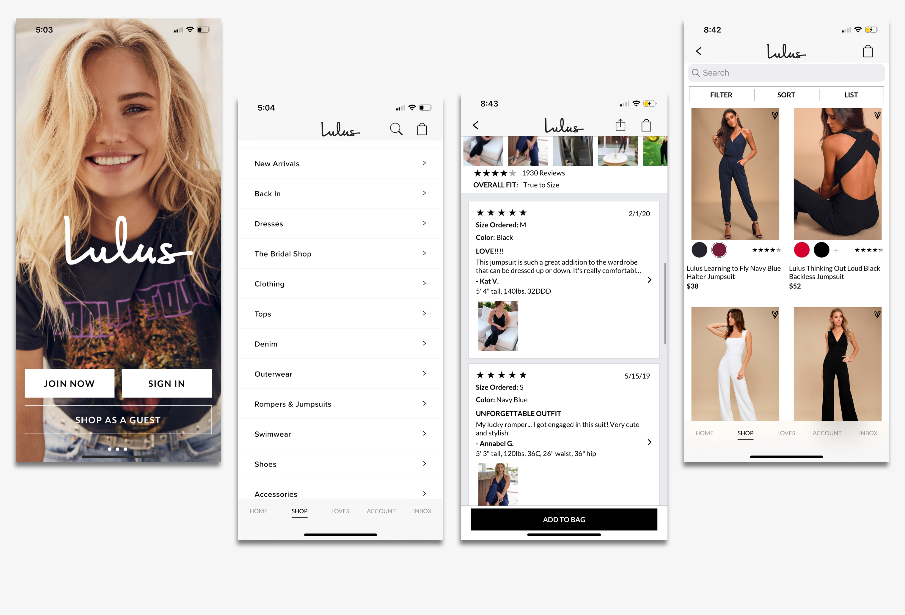
The first step was doing a competitive audit on other shopping apps as this was a brand new app and needed to see best practices of design and the flaws other the other apps could have. For FITz I took a lot of inspiration and ideas from Lulus as they had a very seamless design and shopping process in their app, while I made sure to stay away from the designs of places like Princess Polly who had a cluttered and noisy UI.
This falls in line with Jakobs Law, in which most people rather have a website or app work similarly to something they have already used. Even using them myself, I found Lulus to be a much more enjoyable and familiar experience in how I could pick out clothes and checkout versus Princess Polly.
Survey
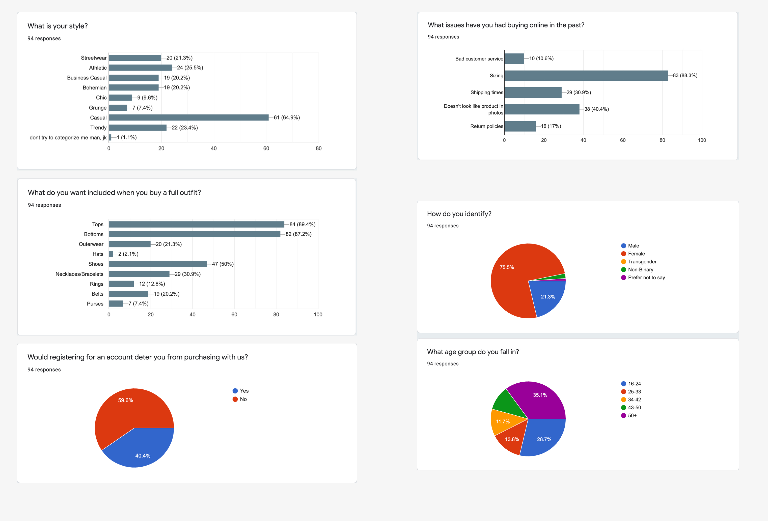
After the initial audits and inspiration gathering, I wanted to dig deeper into the thought process of the general online shopping population. I sent out a survey and received 100+ responses on questions pertaining to popular styles, issues of buying online and demographics.
This was important for me to understand, I wanted to build an app that focused on seamless design and familiarity but was also relevant. When building out an outfit based application, I need to know which styles are trending and the most popular. The demographics were about what I expected, a majority of females are online shoppers but to be fair, this could just be the pool of participants. With that in mind, I did want to try to make the application as neutral as gender neutral as possible.
One on One Interviews
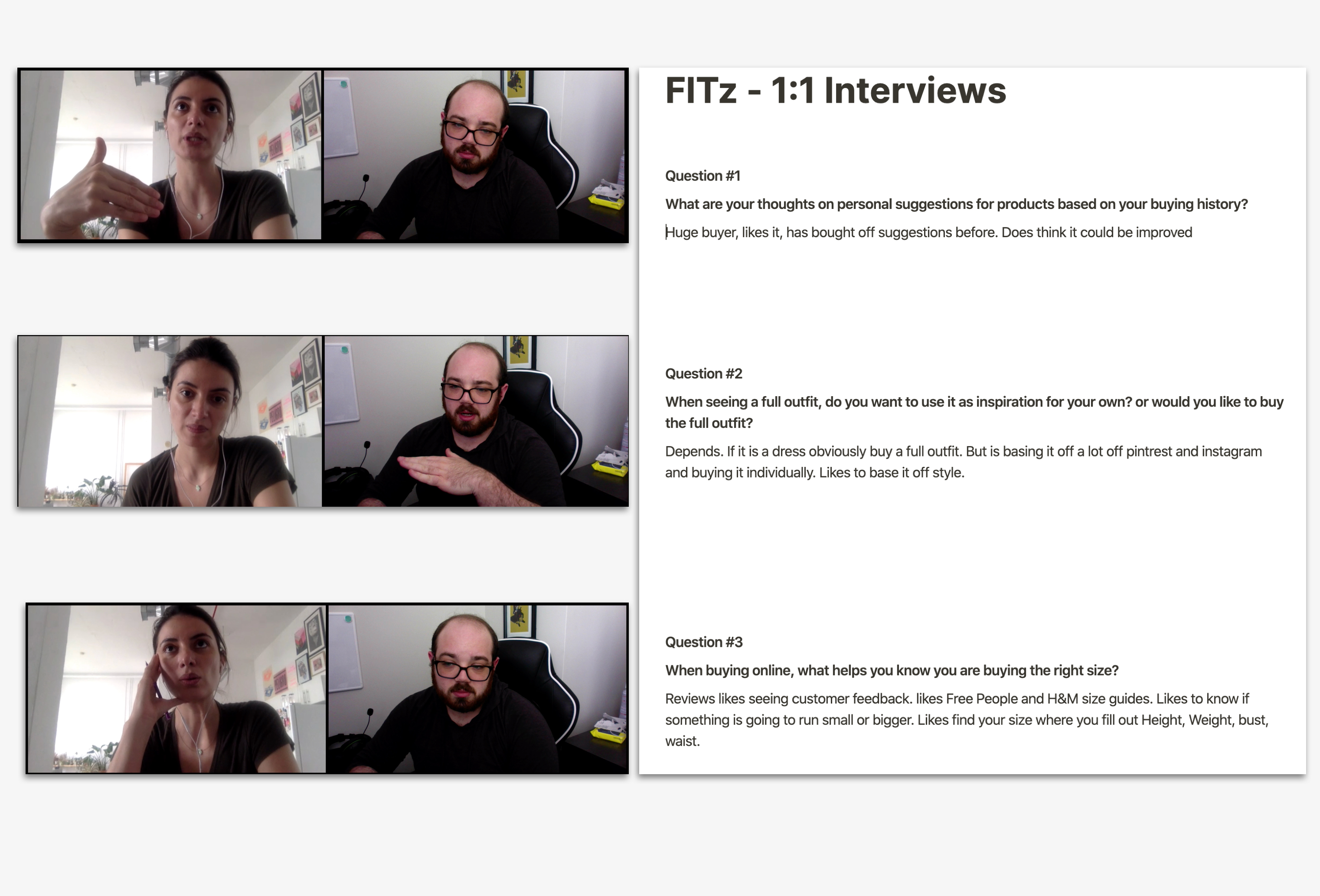
Coming into the 1 on 1 interviews, I wanted to dive deeper into specifics that weren't answered by the survey. The first question I asked had to do with personal suggestions, this was due to the fact that I did see a close to even split about having an account, and was interested in seeing if having personal suggestions would help encourage customer sign ups. What I got from that question is that my interviewee did like personal suggestions and had used them before but she felt there was definitely room for improvement.
Question 2 focused on the concept itself, outfits over individual pieces. I got a lot of data on this from the survey but there no such things as too much data and I needed it to justify some design decisions. The final question was a last minute change as an idea for a algorithm led sizing system came to mind. This question fully shaped how the sizing system would be built and designed as this lined up well with the survey data of size being the worst thing about online shopping.

Sitemap and User Flow
After I compiled the data and finished some more auditing, I went to shape the applications infrastructure as well as a general consumers flow.
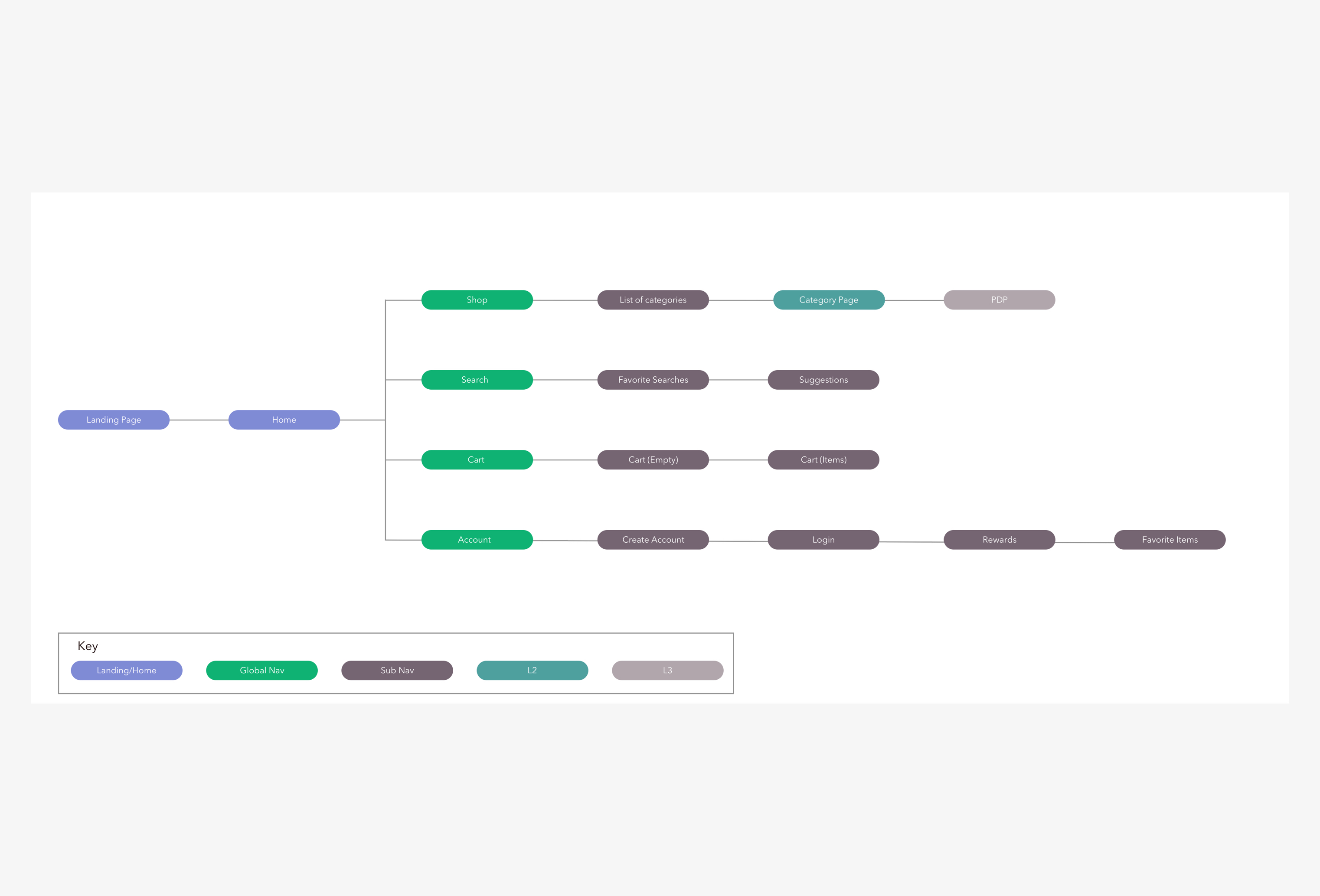
As a mobile application, I wanted to keep the menus simple and easy to use. As said throughout my discovery process, keeping it familiar and seamless. Four menu options; Shop, Search, Cart and Account. These were the choices I made as being the top level navigation, it allowed for an instantly recognizable flow for the user.
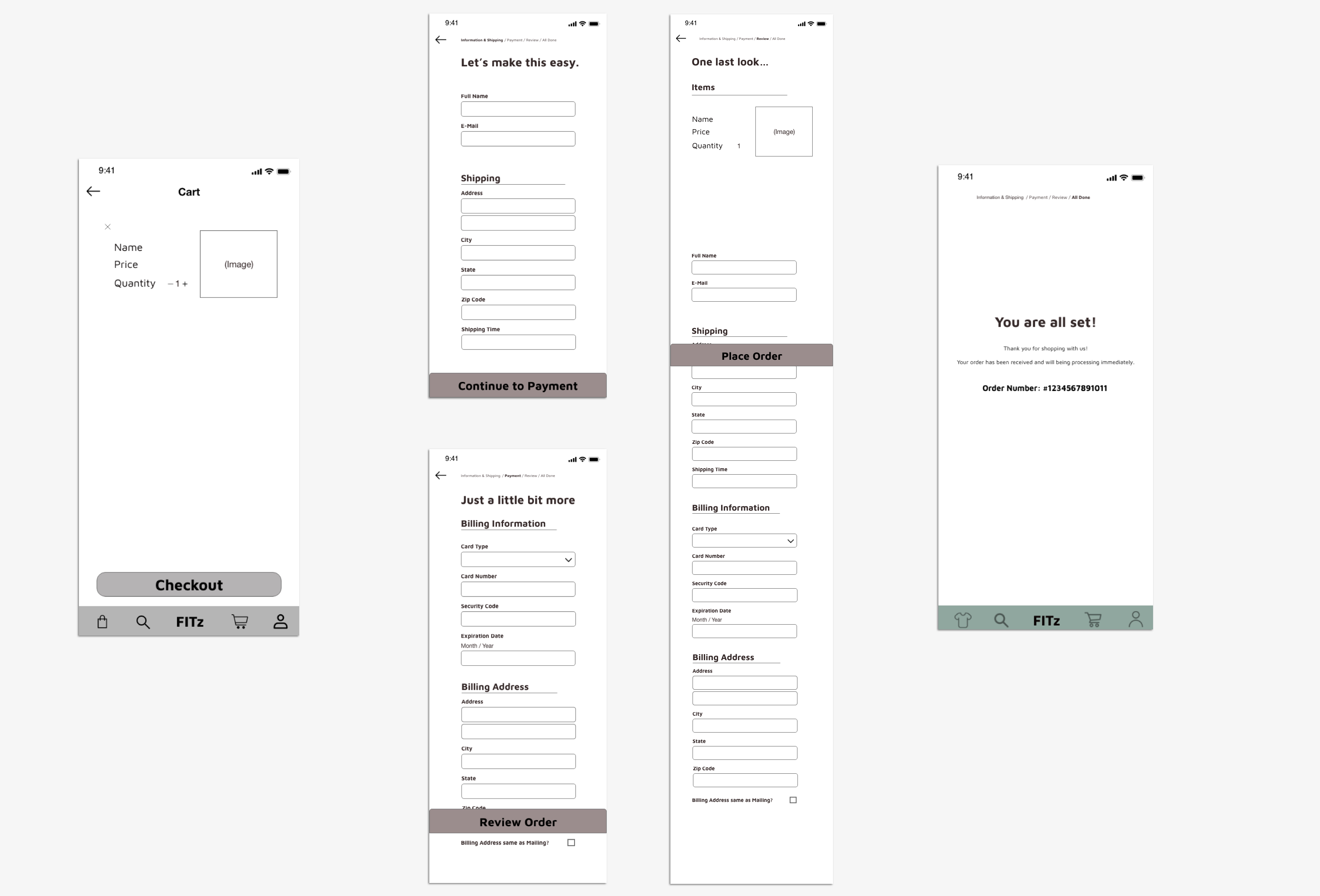
With the sitemap showing the infrastructure, I built out the general user flow of finding, buying and checking out. It should be simple as just finding the item you want, adding it to cart and going through the checkout process.
Personas
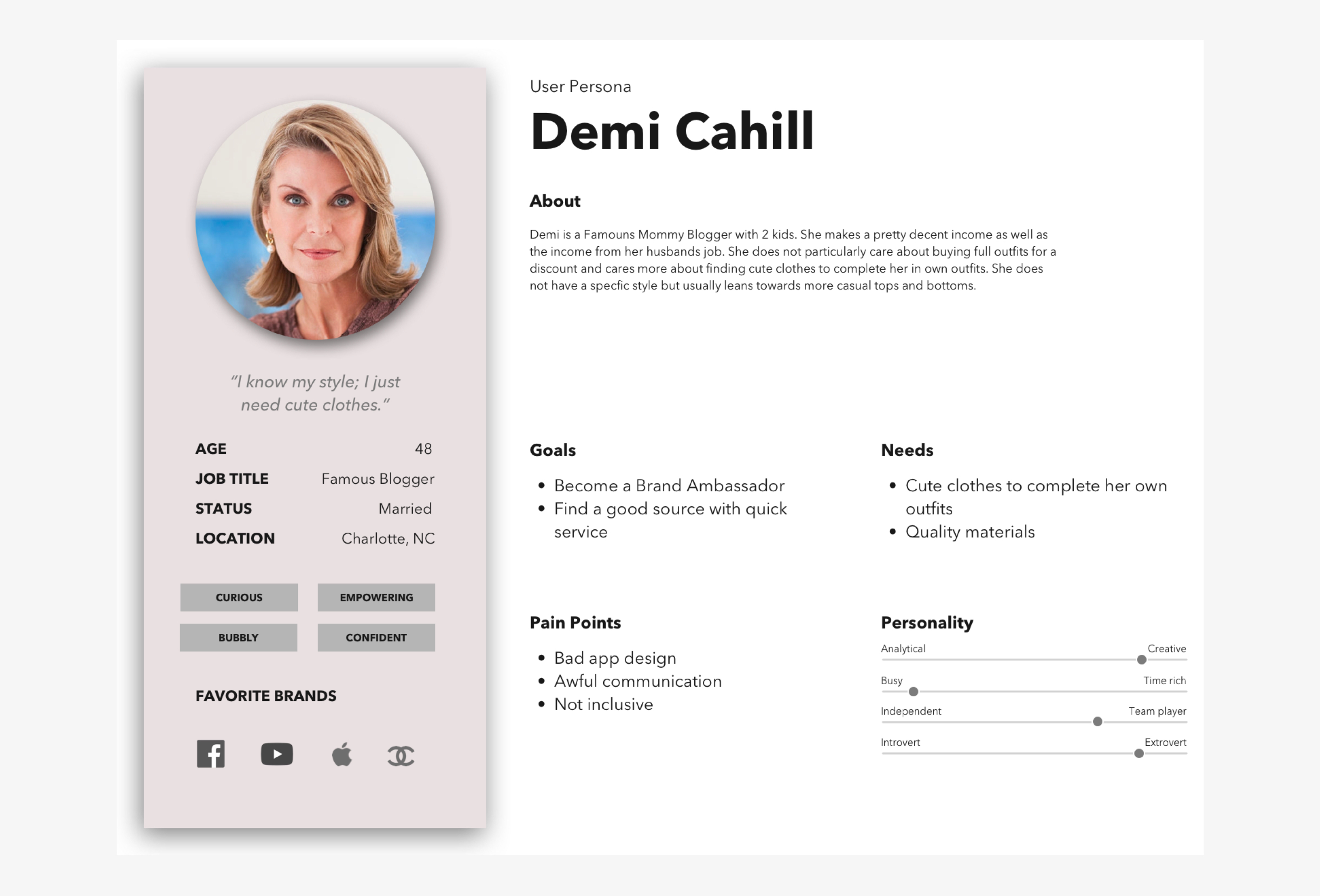
Now going back to the demographics I collected and combining it with the user flow, I built out 2 personas of customers who theoretically be using this application.
We had Kevin Schaffer, the HR Manager from Orlando who needed help building out outfits that fit his style and Demi Cahill, the famous mommy blogger who likes to build her own outfits with individual pieces. While I did want to focus on outfit bundles, I did see that people did want to get individual items as well, there was a place for everyone. Both had their own pain points including sizing, bad design, no inclusivity, I added these to remind myself who I need to build this around. These were common pain points among the population.

Paper Sketches
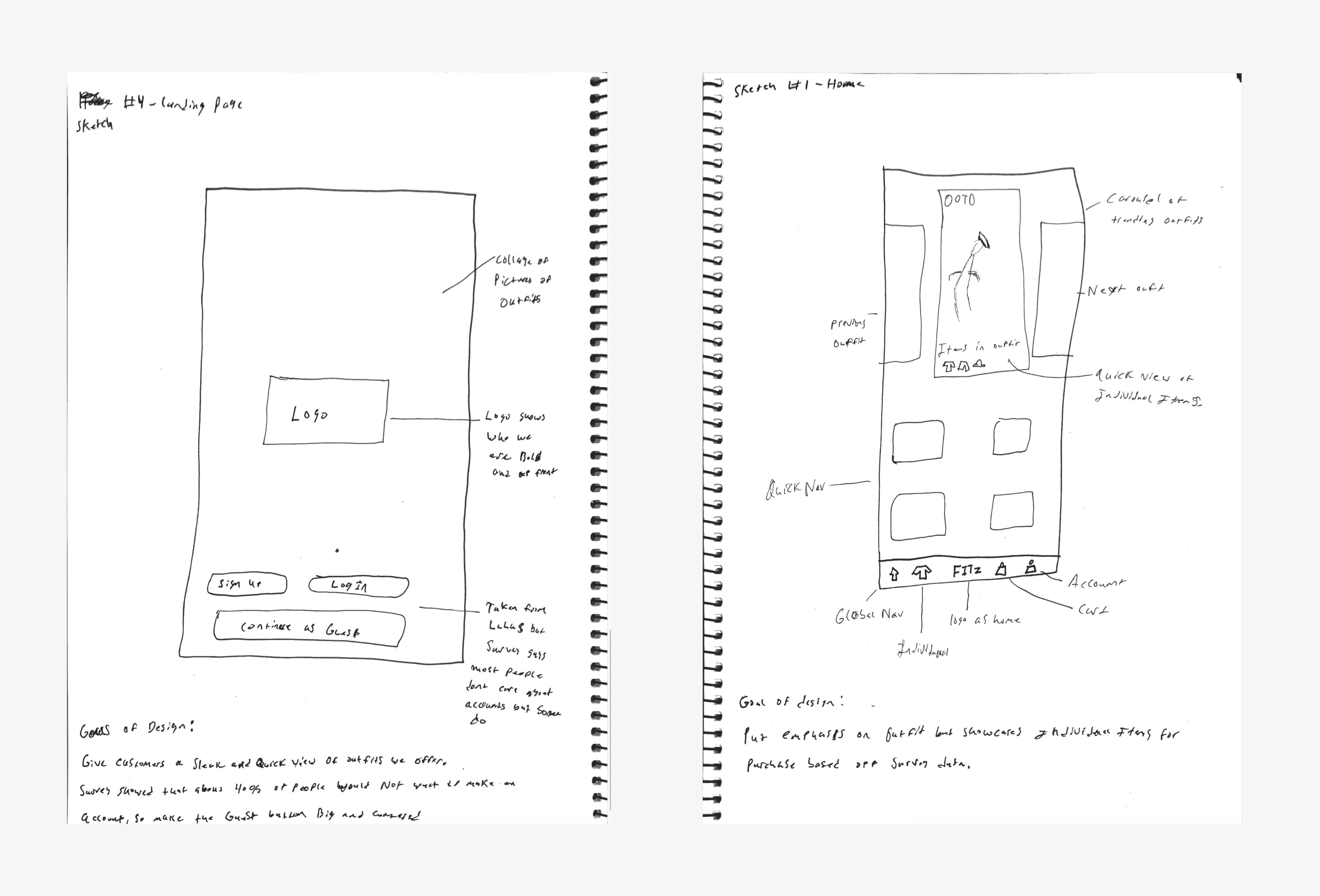
Throughout the discovery and define process I did paper sketches as ideas came to mind. These obviously changed daily as new data was recorded but the sketches had elements that stayed consistent throughout. One of these elements was the carousel system on the home page. The functionality of the carousel changed through each sketch however, with some having a featured outfit for each style placed on the home page for every user to see, and others that changed depending on the users buyer history or preferred style.
Other elements that changed throughout were the on photo lists, this was a system intended to give users a quick glimpse of and even quick access to individual items in the outfit. This system got brought over from the sketches but it did change in size and function.
Wireframes
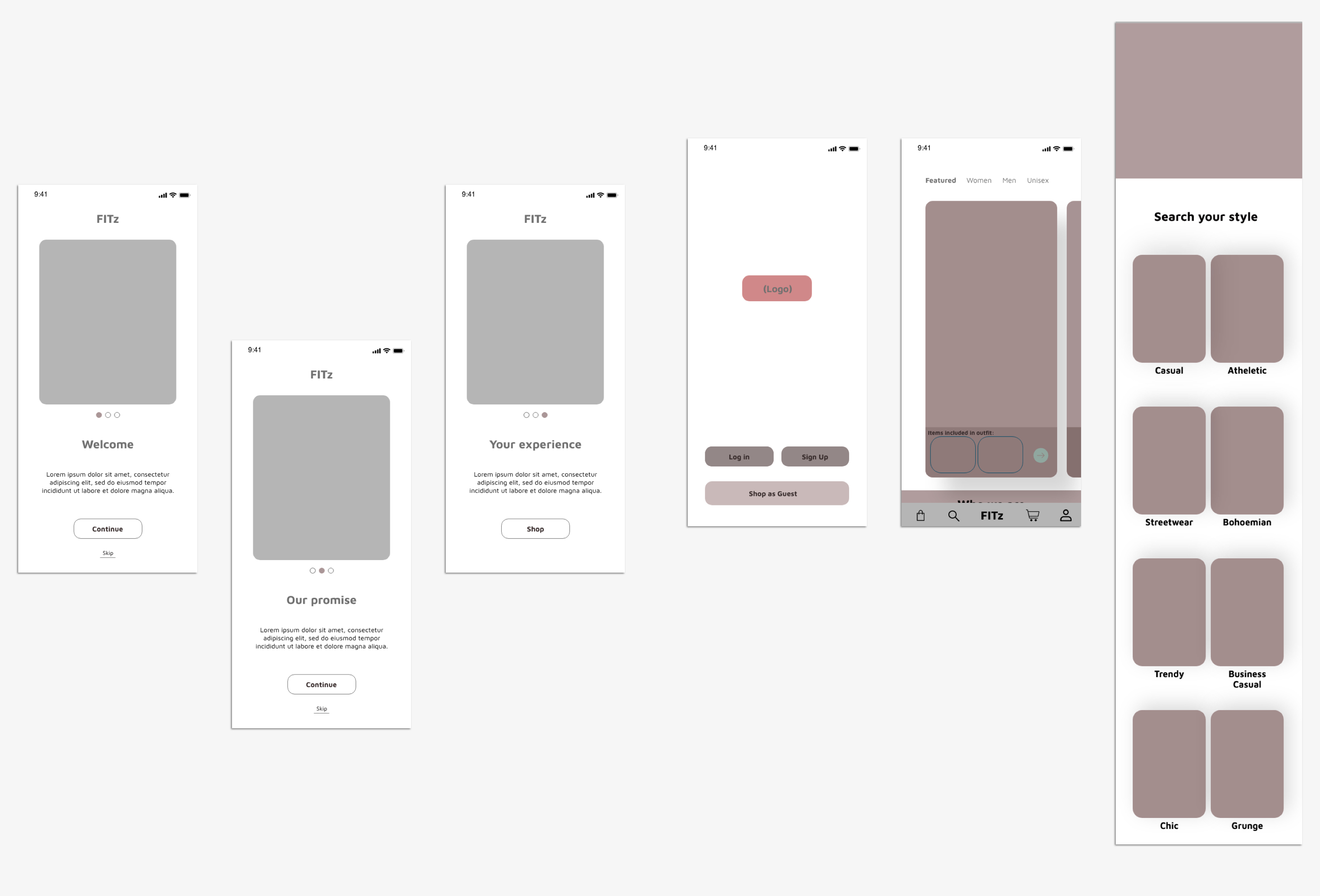
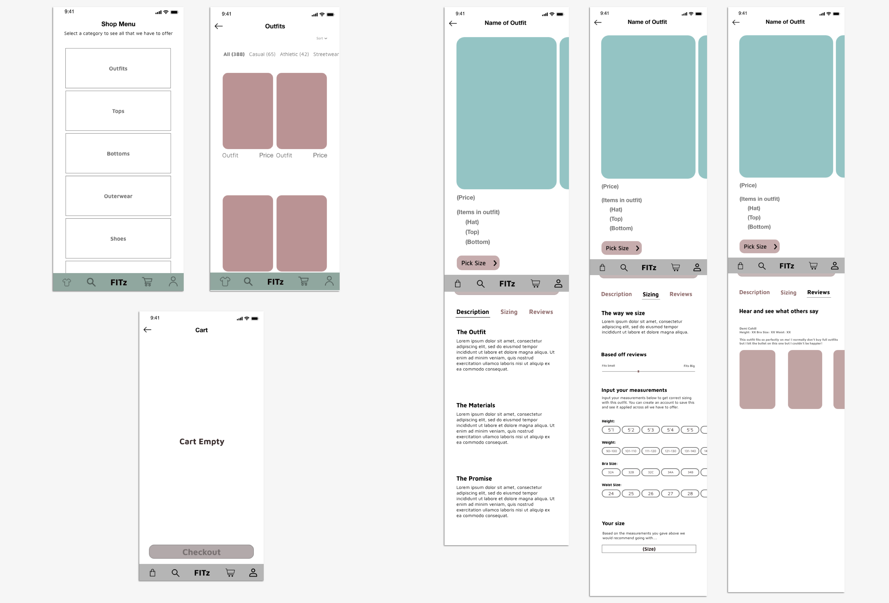
You will see here the final wireframes for FITz, only because I in no way could post the 150+ wireframes I had for the application.
The wireframes themselves changed tremendously through the process, trying out different design laws and best practices, layouts and even interactions. Some wireframes in the early iterations had too much information at once, confusing icons or terms, things that generally got weeded out over time.
The home page and product detail page did see the most change and progress. The PDP was constantly adapting to the idea of a sizing algorithm and how we present that to the user, what we ended up with was an algorithm that took sizing based off reviews like a lot of other online shopping services and FITz's own system that used a chip based selection that would give the user the size we recommend for them based off their Height, Weight, Bra Size (if applicable) and Waist Size (if applicable).
To the left here, you will see the functioning prototype with many interactions that were developed to help enhance the usability and feedback of the application. Please note that certain interactions do break easily, there is an exit in every page should this happen.
Mockups
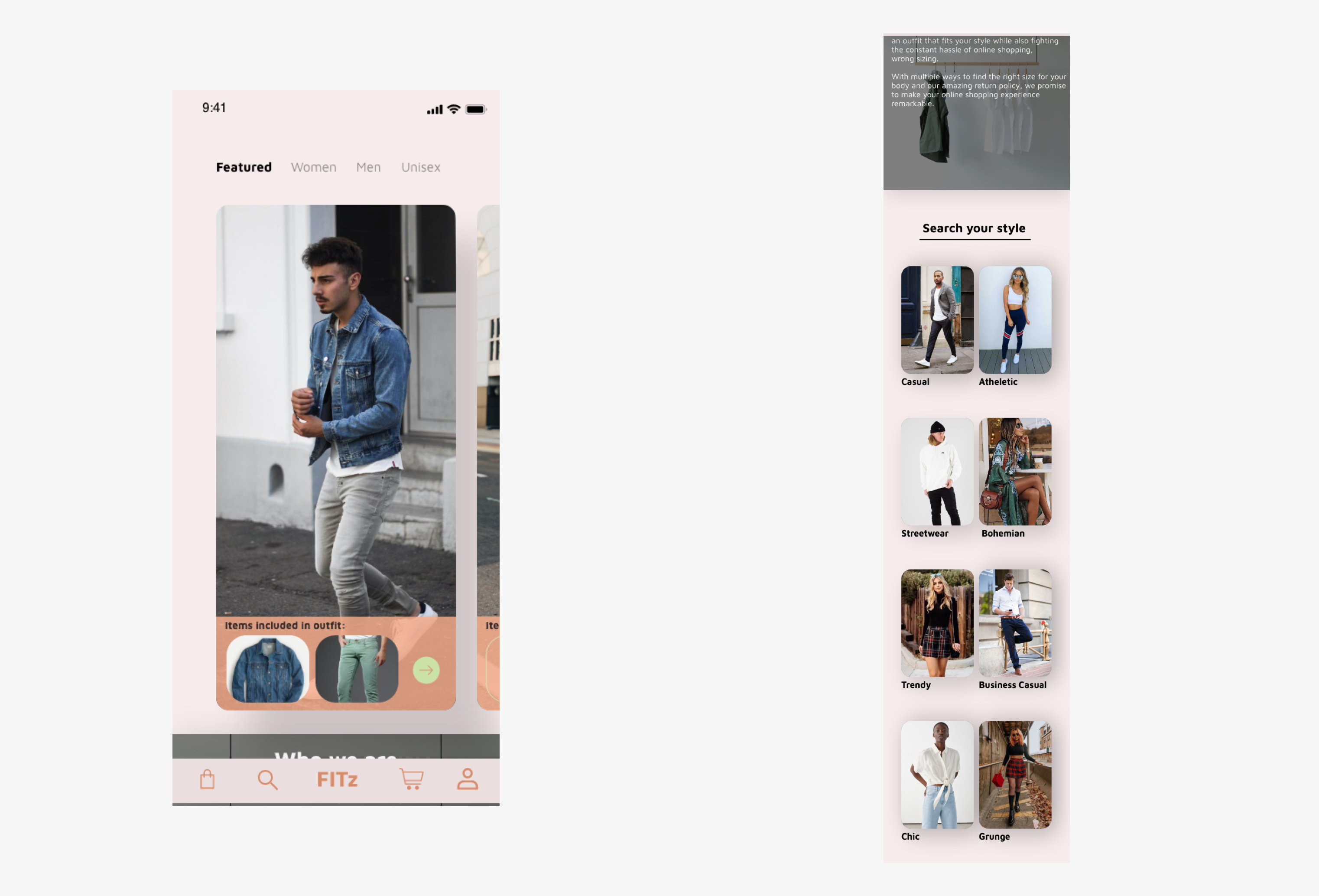
To finish off this sprint, I wanted to get color and images on the homepage to really show the stylish UI.
As you could see in the wireframes and now here, each style offered has quick access with photos to represent that particular style. Photos were really the shining point in this, the outfits and clothing pieces had to stand out as best they could to really push the sale and possibly introduce someone to a new style of clothing.
All in all, FITz was a fun sprint to work on, it let me try my hand at eCommerce but allowing for me to throw some fresh ideas on the table that can shake up the industry a little bit. I will eventually come back to FITz and finish more mockups and continue developing this application.

