SpaceX Redesign
Project Background:
The purpose of the SpaceX website redesign is to keep the theme of space exploration, fleet of ships and missions being done but also make it more user friendly and appealing to a general consumer.
My Role: UX/UI Designer
Project Timeline:
Tools: Sketch, Google Suite, Invision
The Framework

I followed the traditional framework of Discovery, Define, Design, Iterate, Experiment, Launch. For a simple and quick redesign though, I did not follow through every task in each phase. This project was more to test my skills on how I could push out a redesign of an overly complicated website.

UX Audit
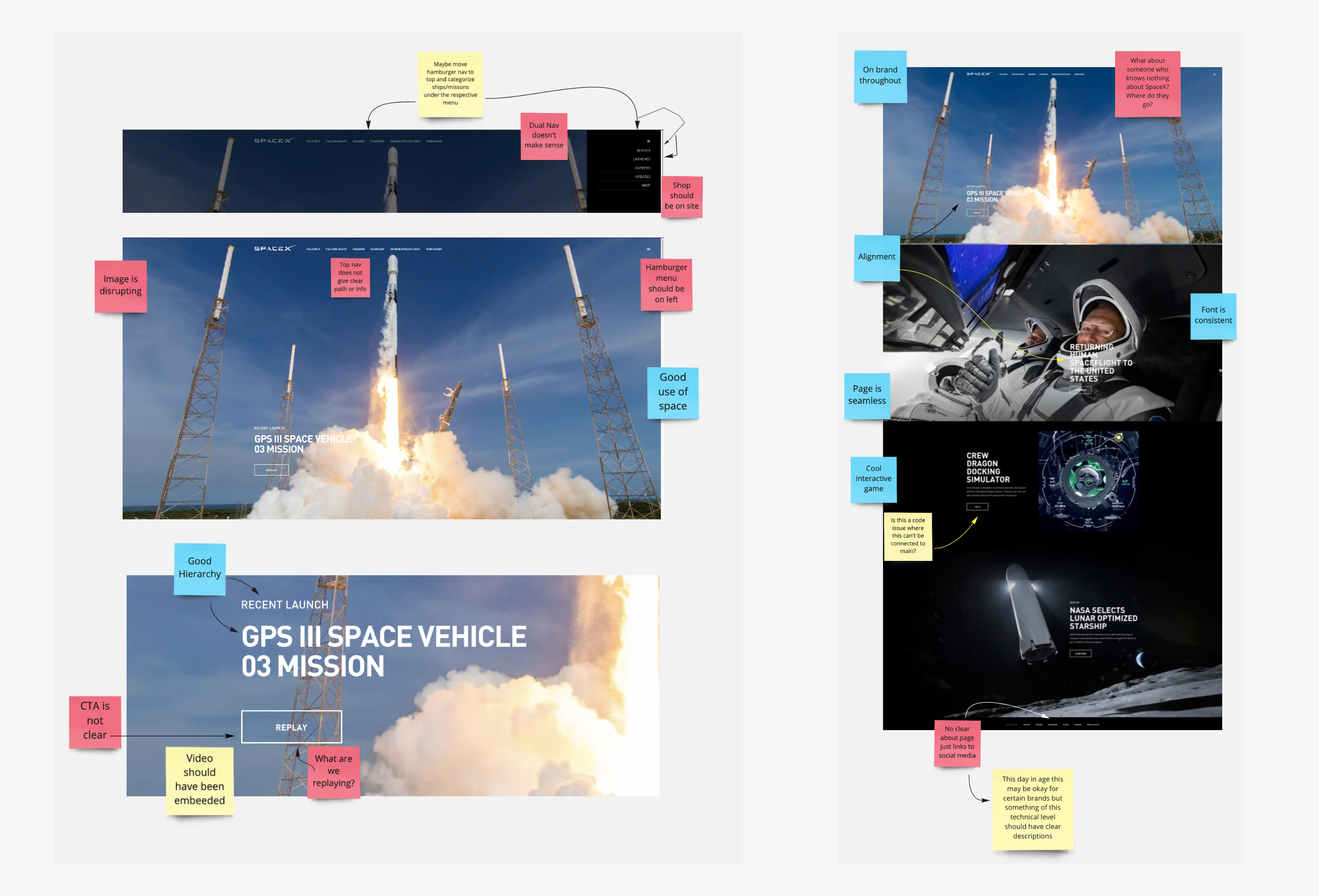
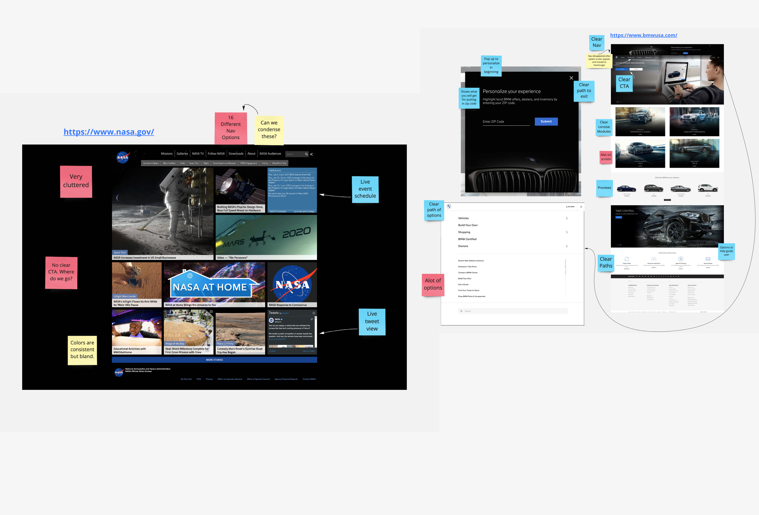
In the UX Audit, I took a look at the current SpaceX website. Taking screenshots and using post it notes, I was able to pinpoint some areas where this website excels and some where it falls very flat. My whole thought process after this task was that the SpaceX experience should be story driven while staying clean. Space is complicated and the science around it can be hard to explain to a simple user so the best way to teach them and help them get involved is to lead them through a story.
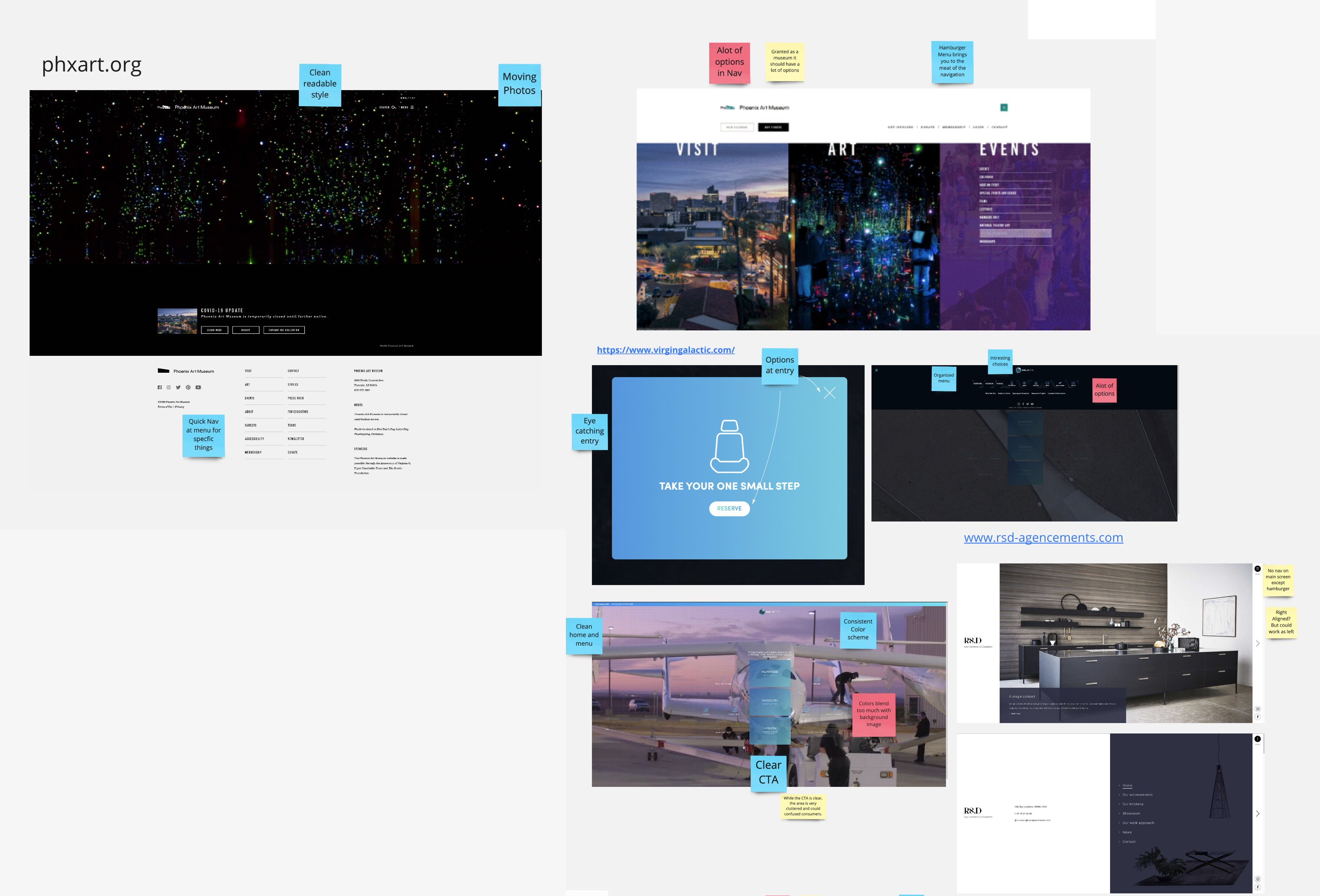
Certain elements as you can see labeled in the pictures above, did not allow for this story driven aspect I wanted to move forward with. Things like non-descriptive and unclear call to action buttons, navigation being confusing and not using best practices. Other aspects though did well, eye catching pictures, open space to allow breathing room and even an interactive game.
This audit also pointed out that at the moment, the main goal of this website is a place to house the rideshare feature for enterprises. This rideshare feature allows enterprises to send cargo into space on planned SpaceX missions. This being a main source of income for the company means that we need to keep this feature rapidly available and on the forefront of whatever we decide to do.
Competitive Audit
SpaceX is one of very few companies that are redefining the future of space travel and how we explore the stars. Normally this would be a disadvantage because something like an e-commerce site has thousands upon thousands of competitors to audit but I began to think of it as just another travel agency or form of transportation. Using the obvious like NASA and Virgin Galactic, I also took a look at sites like BMW for storytelling and Phoenix Art Museum for how they blend imagery into an eye catching but not overwhelming design.
Looking at websites like NASA it was clear that being educational can be tremendously hard for space in terms of staying organized, they have at least 16 different navigation options and a cluttered home page with no clear hero module. Virgin Galactic does an amazing job of making the website fun to look at but its not practical by any means. BMW had amazing storytelling elements and modules that made it so the user could never get lost and always knew where they could go.
Using these examples it became clear that is possible to be educational, fun and easy to use but how do we combine it?
Social Listening
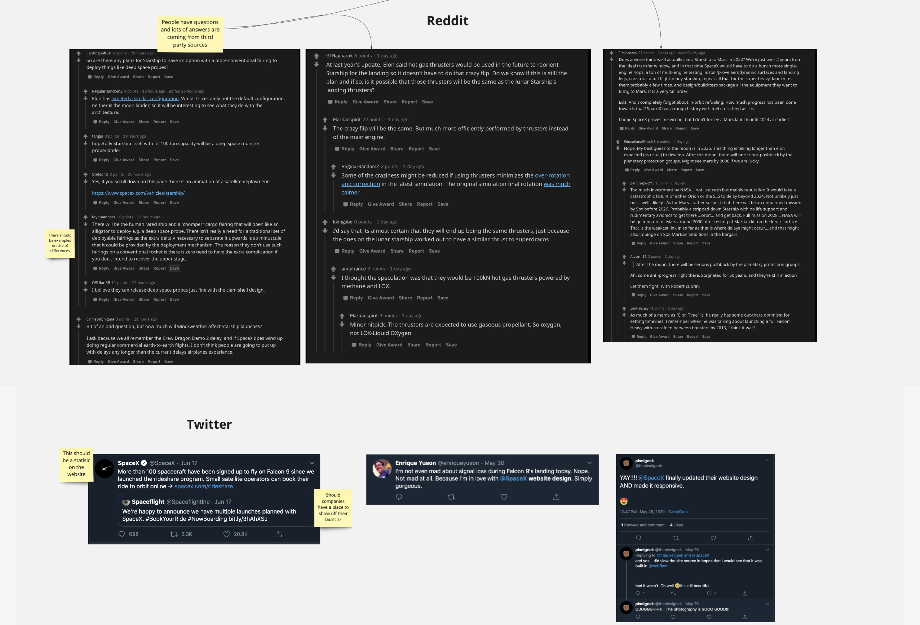
The social listening was a tricky part of this. Most people talking about SpaceX on a daily or weekly basis are avid space enthusiasts. Well, that should be SpaceX's main focus right? In a way, yes. However, why not try to expand that audience to casual watchers of launches and help them learn while also giving the enthusiasts what they want?
What we can take from places like Reddit and Twitter suggested that most of this information was coming from insiders and 3rd party sources. This is because SpaceX is a very secretive company, which makes sense, they are on the cutting edge of technology and any slips could give competition an advantage. This remains true even going into the data collection.
There was interesting comments about the current SpaceX website, things like the photography being gorgeous and being responsive. This does line up with the UX audit we did but in these specific comments we can tell that we need to keep the photography.
Data
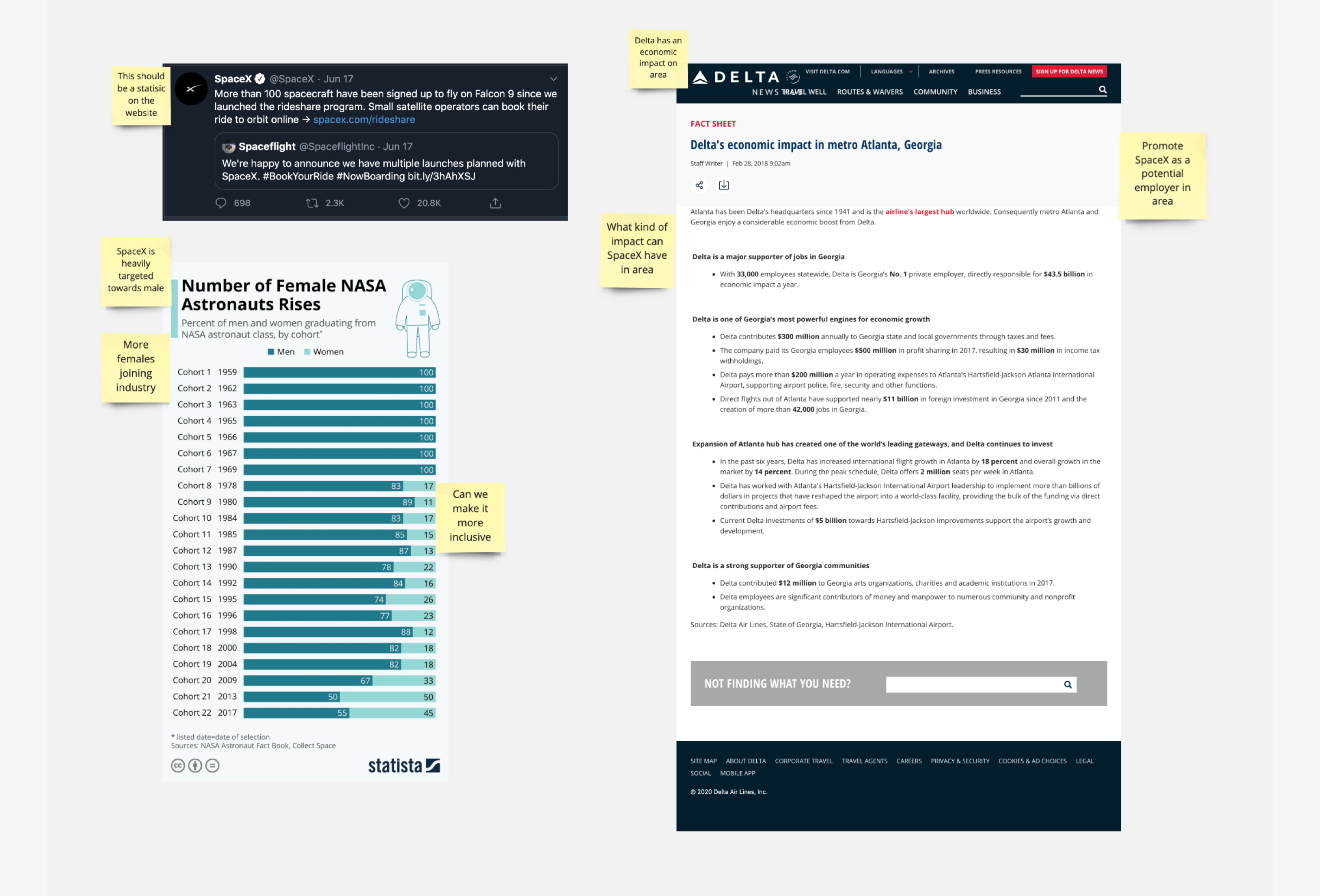
As said before, data with SpaceX is scarce. However, What we did find is that there was a few things they did miss out on. Examples were showing the economic impact that a SpaceX facility could have in the surrounding area such as Delta to Atlanta, and how there has been a rise in female astronauts and in the STEM fields in general.
So what do we do with that? Well for starters, we should use the data on females to help design the website in a more gender neutral way that appeals to everyone. With economic impact we should use something on the website to put focus on the good that comes from these launches to small business in the area.

Sitemap
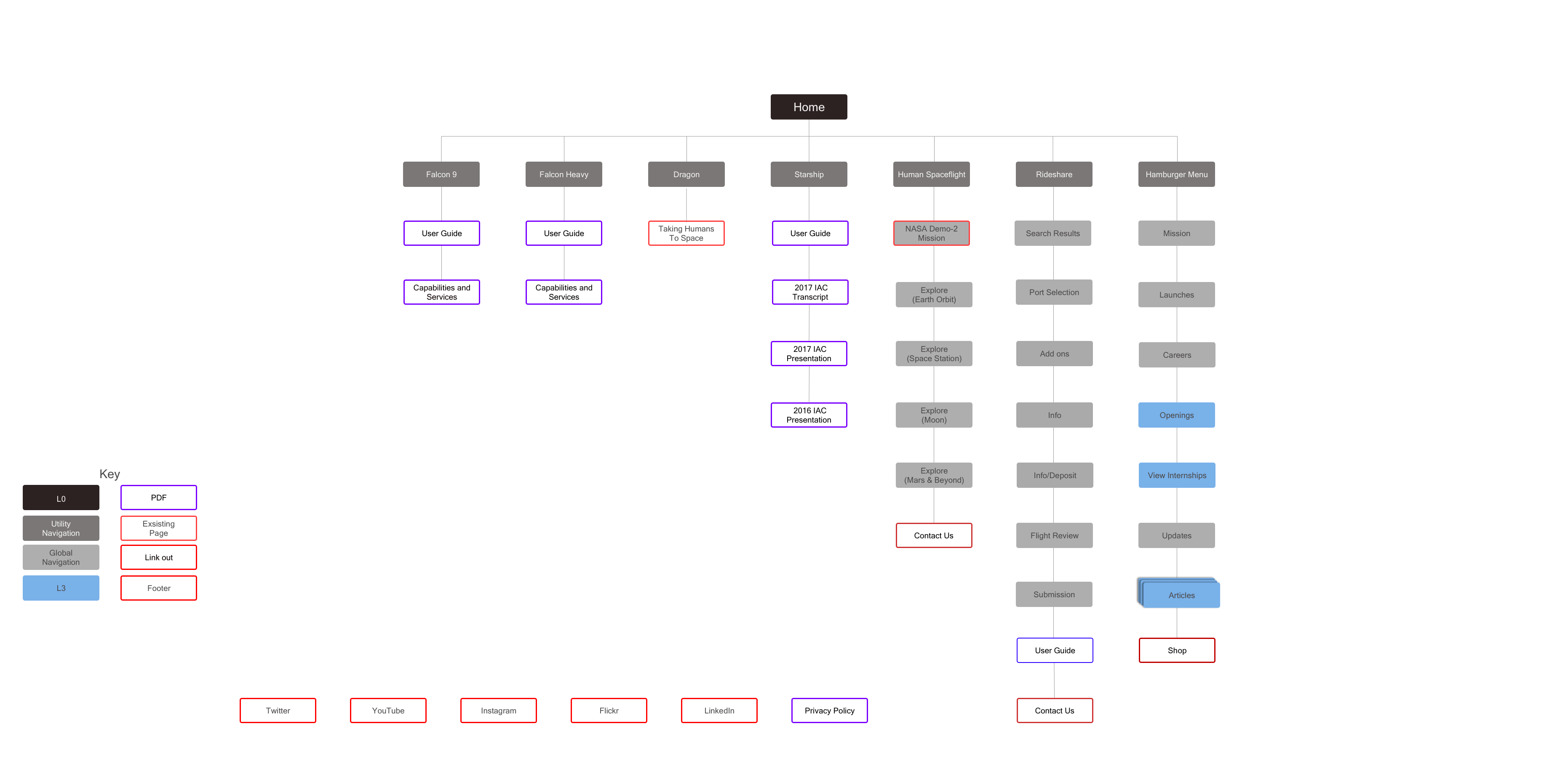
To make it easier on myself, I built out the sitemap of the current website. I wanted to see from a high level the connections between pages. This however, showed how overly complicated it got with pages hidden behind other pages with no clear guidance and some pages being on an entirely different site.
Now some of this could be chocked up to coding issues but others seem to be an error in the design and how they organized information.
User Flow
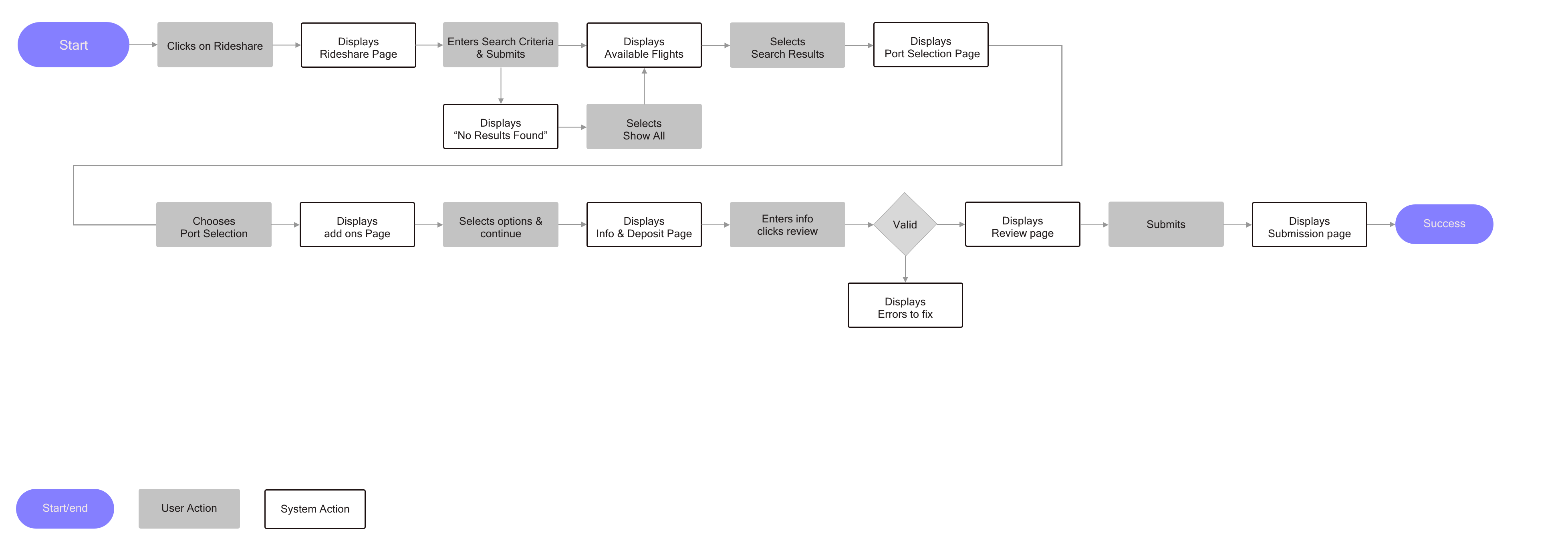
As with the sitemap, I decided to do a flow of the rideshare feature. This was more because I did not want to mess with this feature. As a big source of income, with transactions starting at $1.25 Million, the transaction system seemed pretty clear and concise.

Paper Sketches
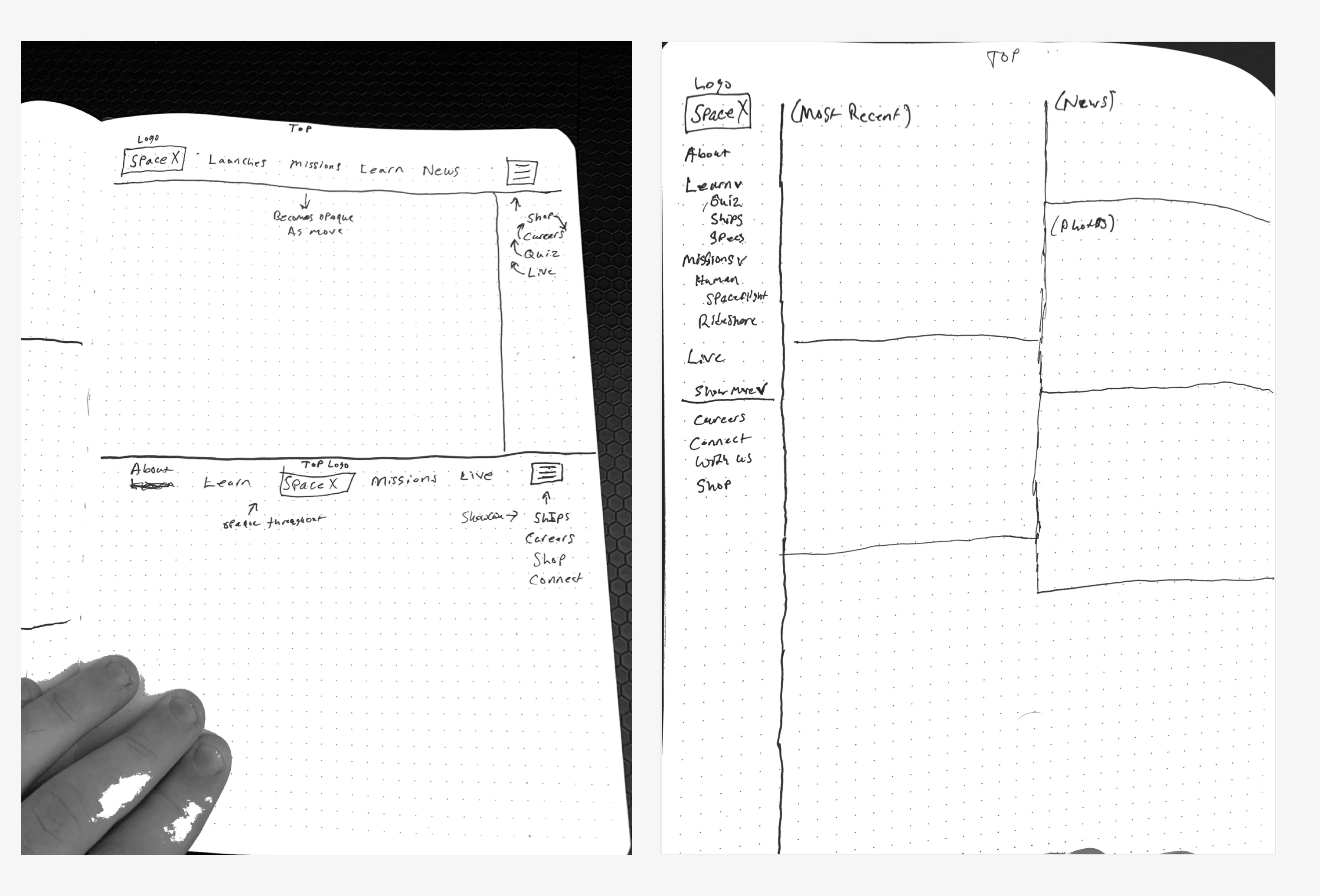
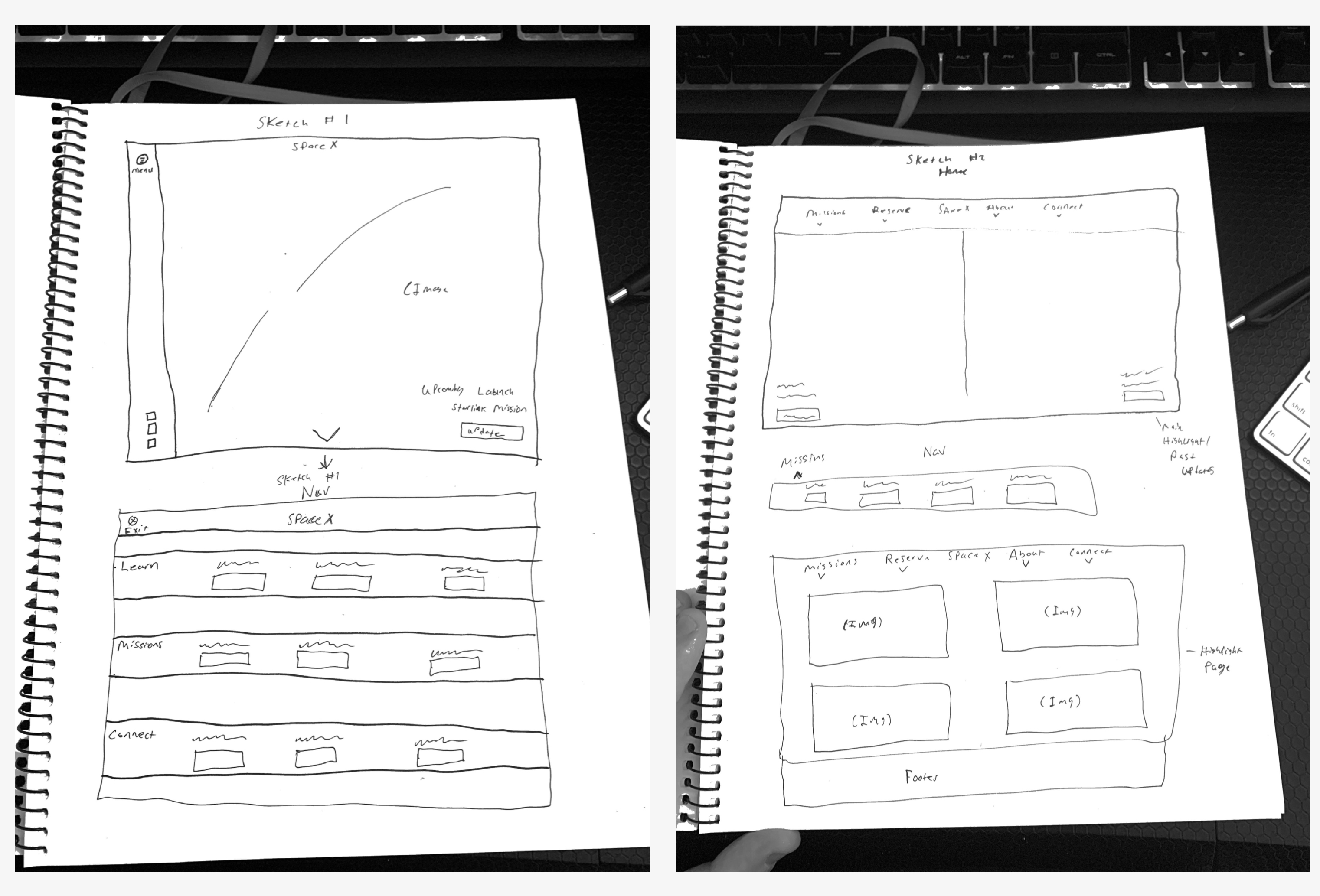
Paper sketches showed me that there was such a thing as "too clean" of a design and others trying to make it organized ended up making it feel like NASA, to cluttered and not friendly for the user.
As I continued to sketch I ended up going for a layout that kept a similar style of keeping the photography prominent but in a way that might not be overwhelming to a new user on the site. However, as is normal, the wireframes iterated on this sketch and grew.
Wireframes
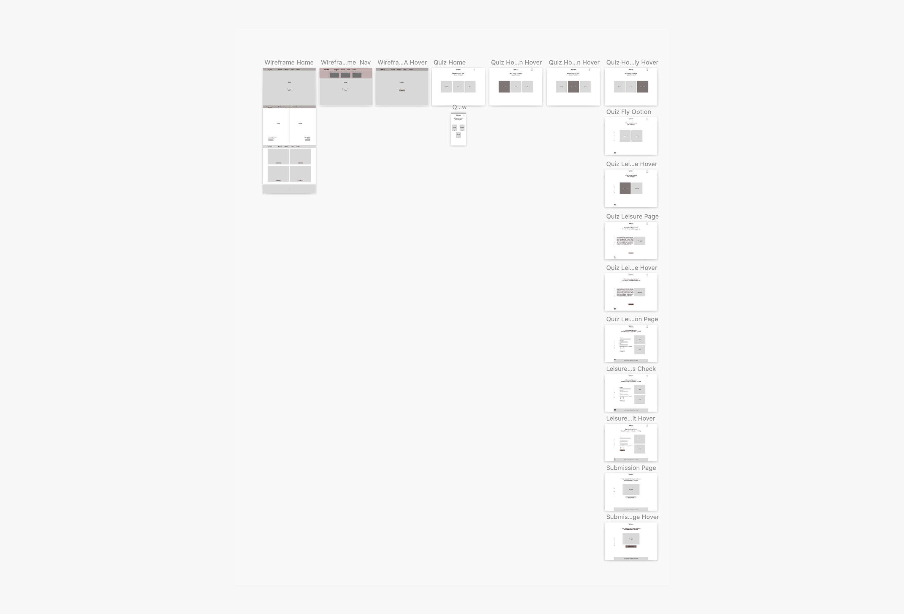
With wireframes I wanted to really get a feel for the flow of the home page, and after many iterations I ended up with what you will see on the right. I talked about not making it overwhelming for a first time user and what ended up being the best way was to have them land on a dedicated hero module. The rest of the home page was the dedicated to the photography, links to past launches and repeats of navigation options.
The navigation got a rework with it being dedicated to container pages. One of the biggest downfalls of the navigation on the original site was it gave a link for almost every single page, and while normally this isn't a bad thing, the best practice is to decrease the amount of clicks the user has to do to get to their destination, what happened on the original site is that there was too many clicks. This was similar to the problem that NASA had on their site. By containing it we were able to make the navigation less cluttered and following best practices, and guide users to specific destinations on the site.
Now regarding the hero module, on the official site it was dedicated to the last launch or any updates regarding that launch. What came to mind was to use that storytelling element I talked about earlier and let the user experience the site in a similar way to Virgin Galactic but with there being an actual use to it.
Wireframes - The Story Guide
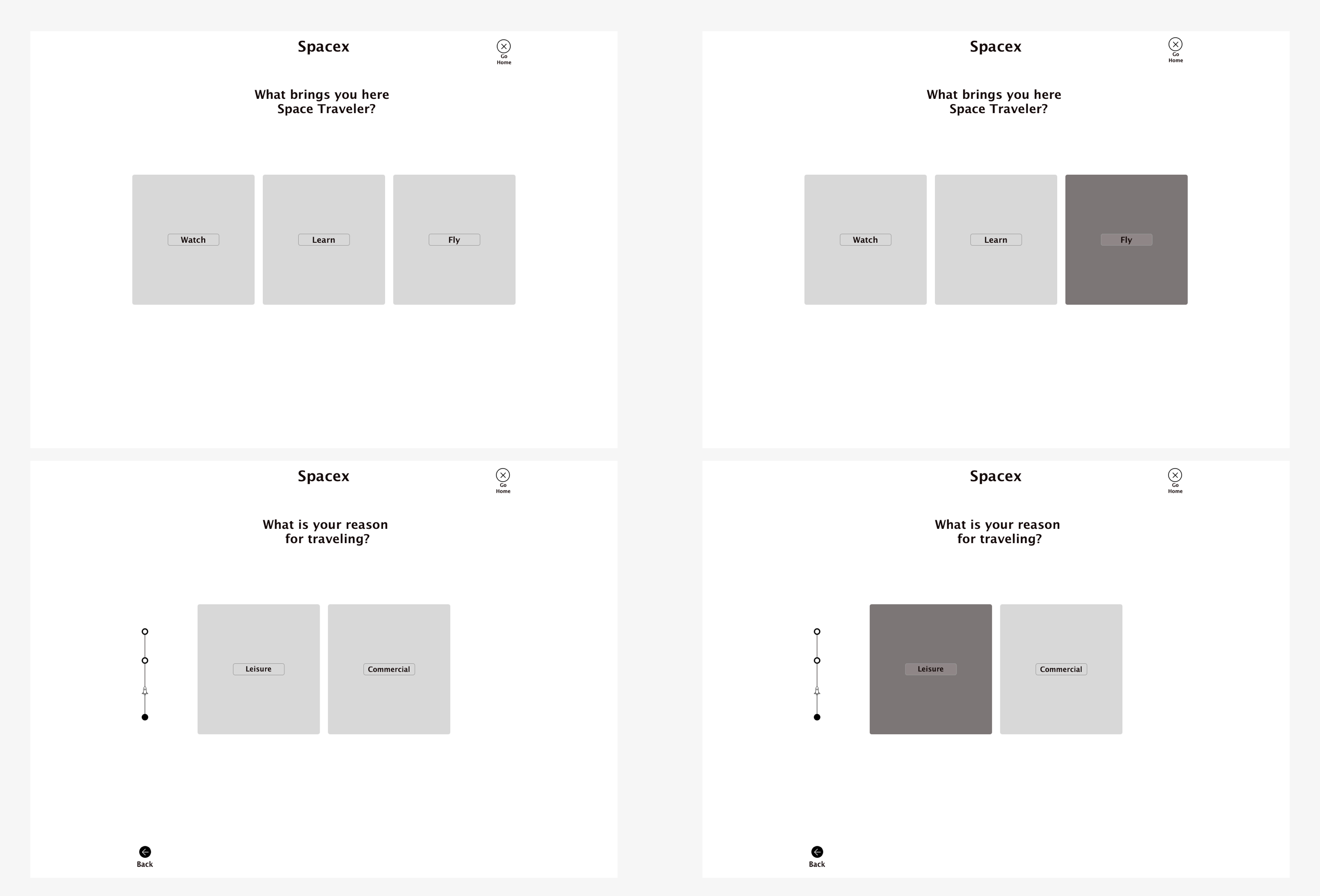
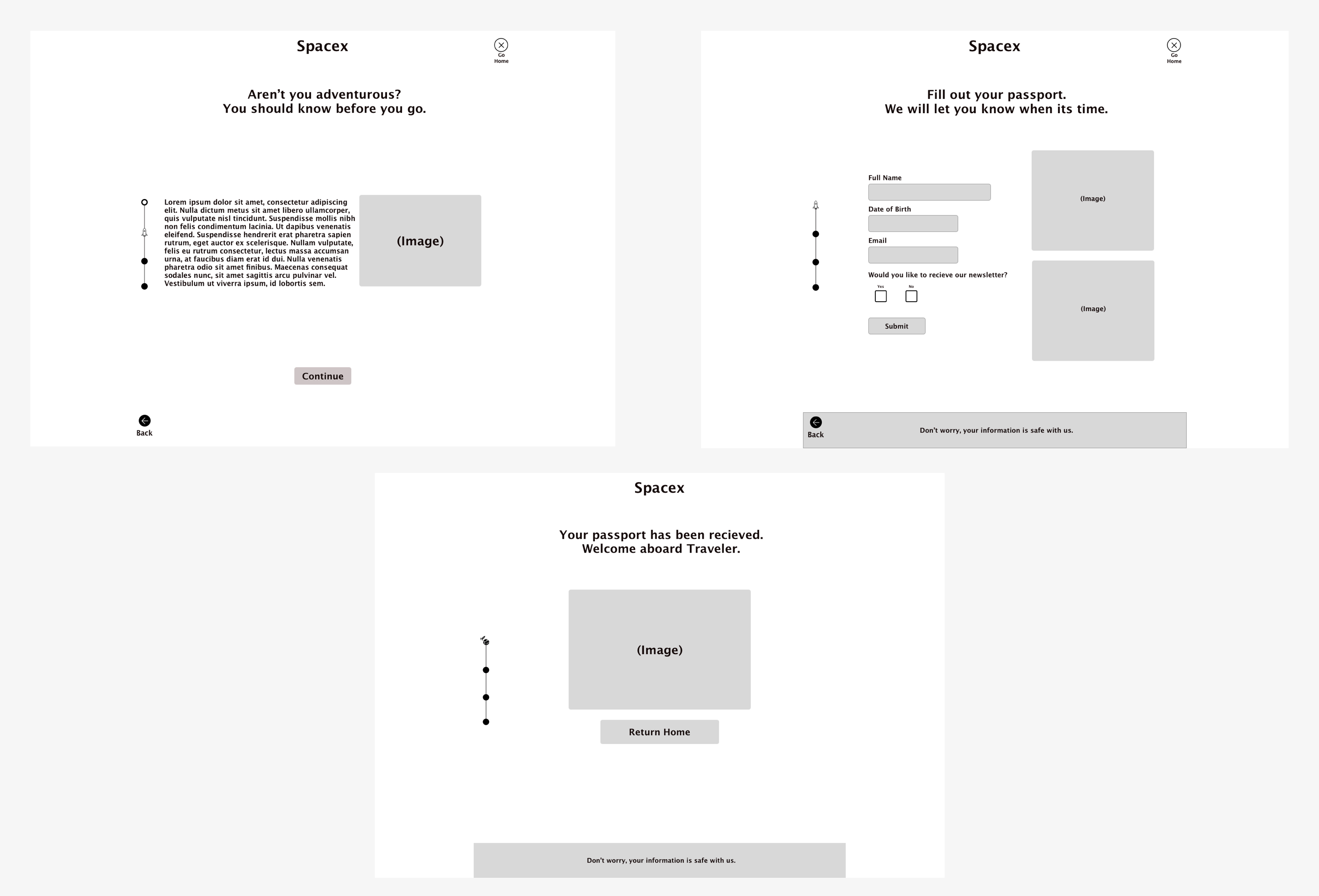
I decided to go with "The Story Guide", this was a wizard that would help guide a user to parts of the website if they did not have a specific idea of where they wanted to go. The easiest way to do this was to stick to the storytelling element, I had the thought of Spaceship Earth at Epcot in my mind while doing this. At the end of Spaceship Earth it asks you a series of questions that help build what your future may look at, why couldn't this be the same?
Starting with the homepage of the wizard, I kept it to a maximum of 3 options, Watch, Learn and Fly. This was how the rest of the website had been split up so this allows it to quickly guide them to different areas of the website on completion of the wizard. For testing purposes I had built out the Fly path, in which a user who is interested in going to space for leisure would learn more about the process and the mission as well as putting in their information to get updates.
To keep it in theme but not overbearing, I used things like a progress bar on the side that has a spaceship and shows how many pages in total there are as well as the ability to quit and exit the wizard at any time. These tiny details allowed the user to have freedom and never feel trapped in what could be a very hard decision if deciding to go to space.
Mockups
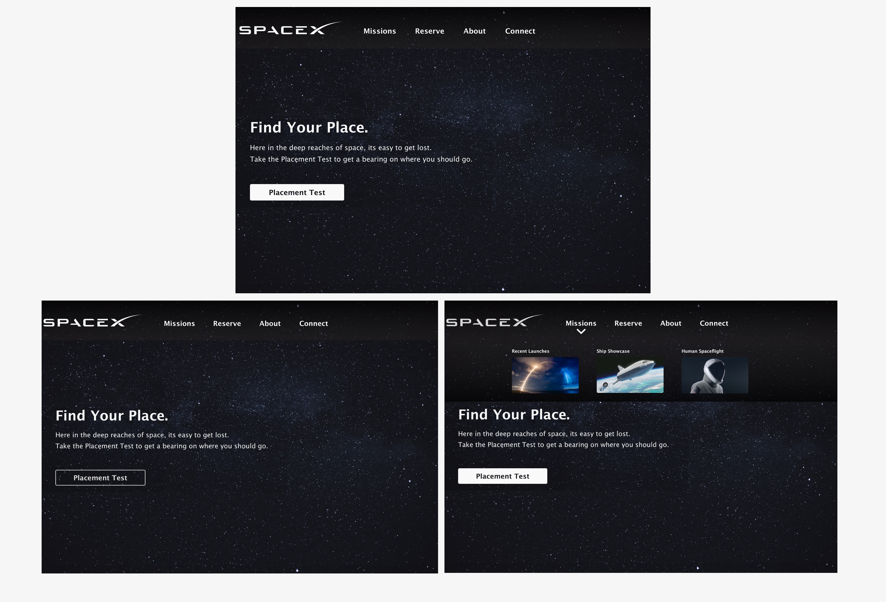
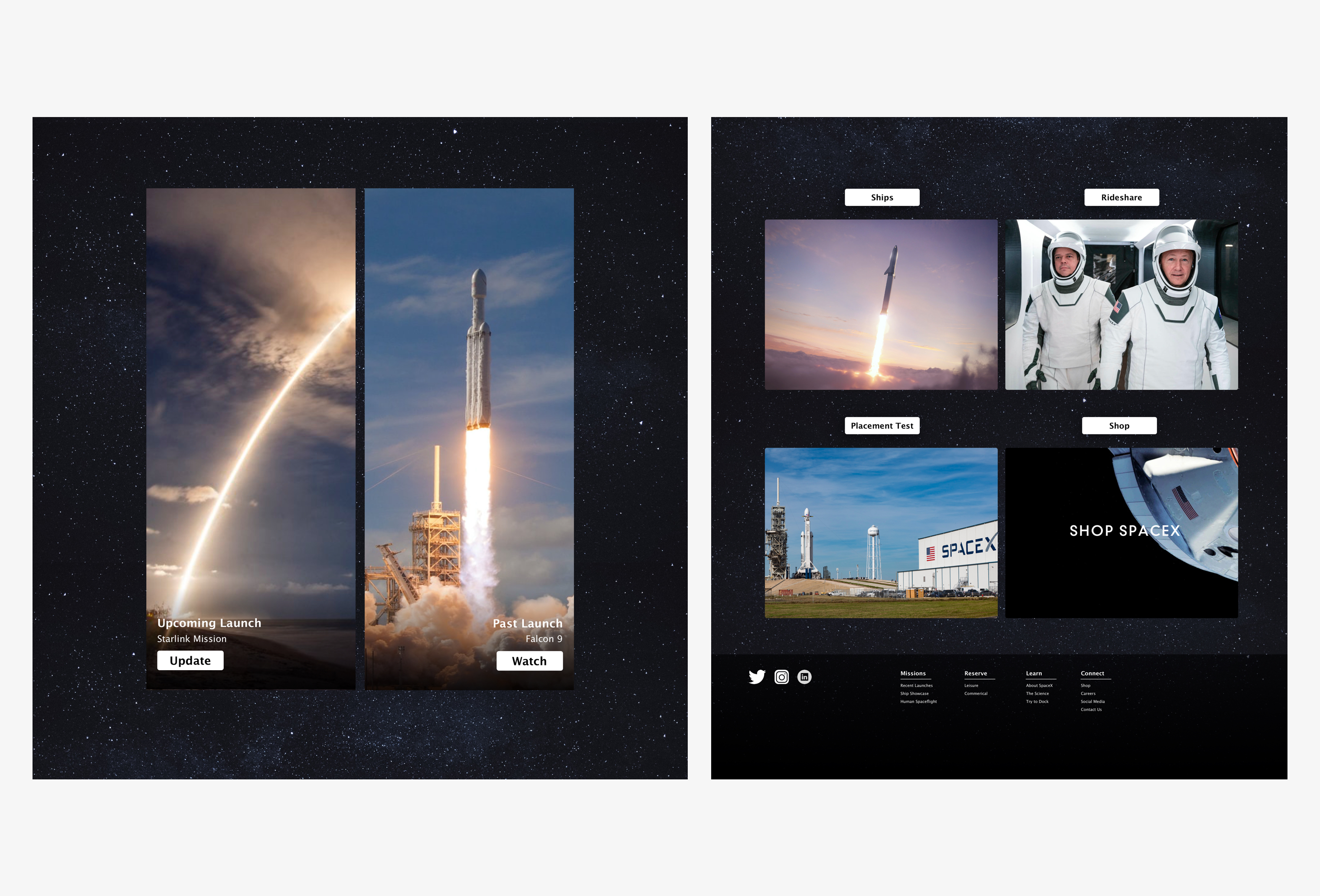
The mockups that are seen here were the final part in all of this. As I genuinely liked the look and feel of the wireframes, the mockups did iterate and allow for more space between elements and better alignment for easier readability. The primary call to action button takes on a more noticeable hover state, the second module with the launches and updates had more dedicated space to them, and the buttons came off the images themselves and went above.
At first I was deciding on going with a more neutral background versus the space background but when testing various looks, it helped keep to the story element the best. You can interpret it as, looking up to the stars yearning to learn more or that you are in space look at the vast expanse all that could be there.
